Design · · 2 min read
Designing WorkTool to feel like part of Windows 11
Why WorkTool is built on WinUI's own theme values instead of a web component library, and what that means for type, icons, motion and color.
WorkTool development
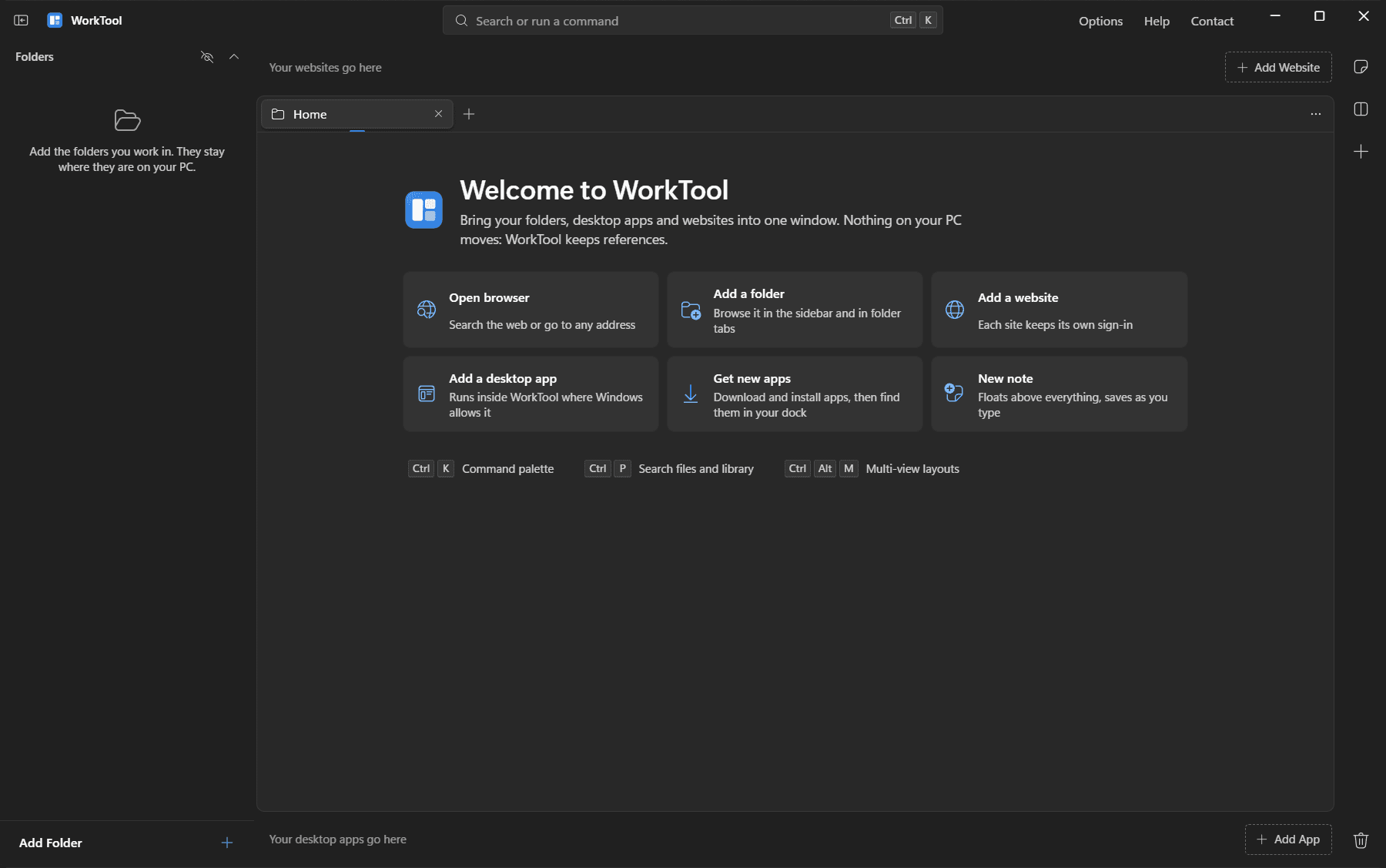
WorkTool's interface is a web page rendered by WebView2, but it shouldn't look like one. It sits among File Explorer, Settings and the rest of Windows 11, and it should feel like it belongs there. These are the design decisions that follow from that.
Not a web component library
The obvious route was Microsoft's Fluent UI React library. It renders Fluent 2 as designed for the web, the look of Microsoft 365 in a browser, which reads as a website inside a window. It also brings a large styling runtime. Community libraries that imitate Windows were either styled after Windows 10 or no longer maintained.
Windows' own UI framework, WinUI 3, publishes its exact theme values: fill and stroke colors for both themes, text colors, the accent ramp, corner radii and control heights. WorkTool's interface is built from small components of its own that use those values, kept in a single token file. That gives the real Windows 11 look at a fraction of the weight, and one source of truth for the dark and light themes.
The details that make it feel native
- Type: Segoe UI Variable, the Windows 11 system font, at 13px for dense lists like Explorer.
- Icons: Fluent UI System Icons, the family Windows 11 apps use. The minimize, maximize and close buttons use the system's own icon font, so they're the exact Windows glyphs.
- Corners: 4px for controls, 8px for panes and menus, 12px for notes and dialogs.
- Material: Mica behind the window on Windows 11, solid colors on Windows 10.
- Accent: a restrained blue by default, with presets or the Windows accent color.
Motion that gets out of the way
Every animation is a CSS transition between 100 and 220 milliseconds, using WinUI's decelerating curve for things that appear. There's no animation library, because every movement in WorkTool is a simple state change. WorkTool follows the Windows "reduce motion" setting, and Options can switch animations off entirely.
Borrowing an interaction model
The look comes from Windows; some of the behavior comes from apps known for fast keyboard work. The command palette follows the pattern of tools like Linear: compact rows, shortcut hints on the right, sections, and a filter field at the top. Split panes are meant to feel like part of the workspace, not like separate windows.